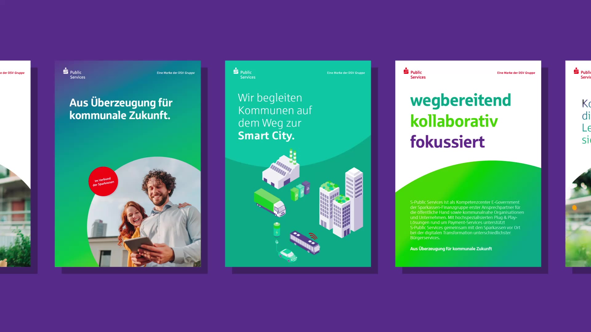
Multiple colorful brochures with large semicircular and circular color shapes in various color combinations arranged side by side.

DSV Group

Making the Sparkassen stronger together

Intro
Challenge
Approach
Impact

The DSV Group is the integrated solutions provider for the Sparkassen-Finanzgruppe. The DSV Group’s strategic brand core formed the starting point for the further development of its umbrella and competence brands.

The challenge was to develop an overarching design system for the DSV Group’s entire brand portfolio as part of the ongoing development of its brand strategy.

Based on the iconic Sparkasse brand, flexible design principles were developed that create a consistent overall appearance for the group while leaving sufficient creative freedom for the individual sender brands. An umbrella-brand endorsement clearly communicates each competence brand’s affiliation with the DSV Group.

The new corporate design received an iF Design Award in 2022.

Brand Strategy
Brand Identity Systems
Brand Architecture
Design Guidelines

One design system for all group and competence brands

All group and competence brands use a simple interplay of colour, form and space as their core design principles. These provide sufficient freedom to express the specific content of each competence brand while creating consistency across the group’s overall identity.

Facade of a modern office building with a red DSV-Gruppe logo.

HKS 13 as a defining brand element

The DSV Group’s competence brands are differentiated through individual colour coding. Across the portfolio, all brands share the Sparkasse typeface and the defining Sparkasse red, HKS 13.


Three rows of three differently colored dots on the left with red Sparkasse symbols and the texts 'Payment', 'Management Services', and 'Public Services' on the right.
Several colorful brochures with large simple geometric shapes and texts like 'Public Services' and 'Management Services' are arranged on a white surface.

“Since 2022, the DSV Group has presented itself with a corporate structure clearly aligned with the market. Together, we translated this strategic realignment into a modern, future-ready brand design. The four competence brands independently represent the group’s broad range of services while strengthening its overall identity. With its new employer brand, the DSV Group also positions itself as an attractive and future-oriented employer.”

Michael Gievert Head of Executive Management Office

Shaping the future of payments

S-Payment is the payment competence centre of the Sparkassen-Finanzgruppe. Its energetic colour palette underlines the ambition to actively shape the future of payments. Situational imagery creates enthusiasm for digital payment solutions and puts the end-customer experience at the centre.

Orange background with white text 'Gemeinsam mobile Payment vorantreiben' and white Sparkasse Payment logo.
Six colorful icons showing a credit card with a lock, bar chart with upward trend, shopping cart, smartphone with Sparkasse logo, smartphone with credit card, and document with shield and checkmark.
Three promotional posters on an orange background showing a bearded man with a laptop on the left, a woman with a smartphone in the center, and two hands with a smartwatch and smartphone on the right.
1/3
Two presentation slides titled 'Präsentationtitel Qui quodic tem Lorsam seque lab', one shows a hand holding a credit card in front of a smartphone, the other shows a tilted credit card on colored circles.
Smartphone displaying the S-Payment website showing a woman and a man in a café with the text 'Wir definieren Bezahlen für unsere Kunden neu. Willkommen bei S-Payment'.

Committed to the future of municipalities

S-Public Services is the competence centre for municipal digitalisation within the Sparkassen-Finanzgruppe. Quality of life, future resilience and sustainable technologies for public services are central themes reflected in the urban imagery and graphic illustration style.


Smartphone displaying a webpage from S-Public Services with text 'Aus Überzeugung für kommunale Zukunft. Willkommen bei S-Public Services'.
Two people sitting at a table, a woman pointing at a tablet while a man looks on, blurred plants in the foreground, green area above with text about GiroCheckout.
Green and blue cylindrical battery with white lightning bolt symbol on dark blue background.
Text on green-blue gradient background reading 'Aus Überzeugung für kommunale Zukunft' with Sparkasse Public Services logo.
Exhibition stand with green background banner showing a woman and a smaller white roll-up banner with text and Public Services logos.

From the group, for the group

S-Management Services is the central service provider of the Sparkassen-Finanzgruppe for intelligent software solutions and tailored services. The blue colour palette conveys trust and reliability. Top-shot imagery and abstract close-ups express the ambition to recognise the right connections both in the details and in the bigger picture.
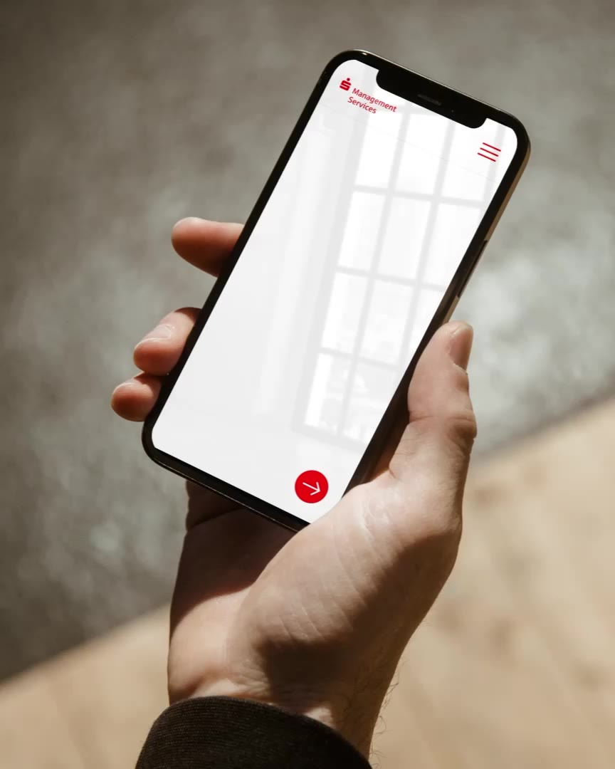
Two blue advertising banners side by side with the text 'Sparkasse weiter denken' and graphic elements including stylized servers and a human.
Blue background with white Sparkasse Management Services logo and text 'Der zuverlässige Servicepartner der Sparkassen'.
Six colorful icons in two columns showing symbols for data analysis, globe, servers, cloud with lock, pie chart, and person with speech bubble.
Advertising board with the text 'Intelligente Softwarelösungen für die Sparkasse von morgen' against a blue background with small people standing on a net.
Three advertising posters side by side with texts about IT structures, management services, and a smiling woman in a white blouse.

Awards

  • iF DESIGN AWARD

Direct line (human beings)

Simon Apfl
New Business, Sounds
simon.apfl@fork.de
Portrait of Simon Apfl.
Dirk Lanio
Consulting, Technology
dirk.lanio@fork.de
Portrait of Dirk Lanio.
Jan Kruse
Creation, Brand
jan.kruse@fork.de
Portrait of Jan Kruse.
Roman Hilmer
Creation, Digital
roman.hilmer@fork.de
Portrait of Roman Hilmer.